
For Sellers
Best TikTok Ad Creative Examples
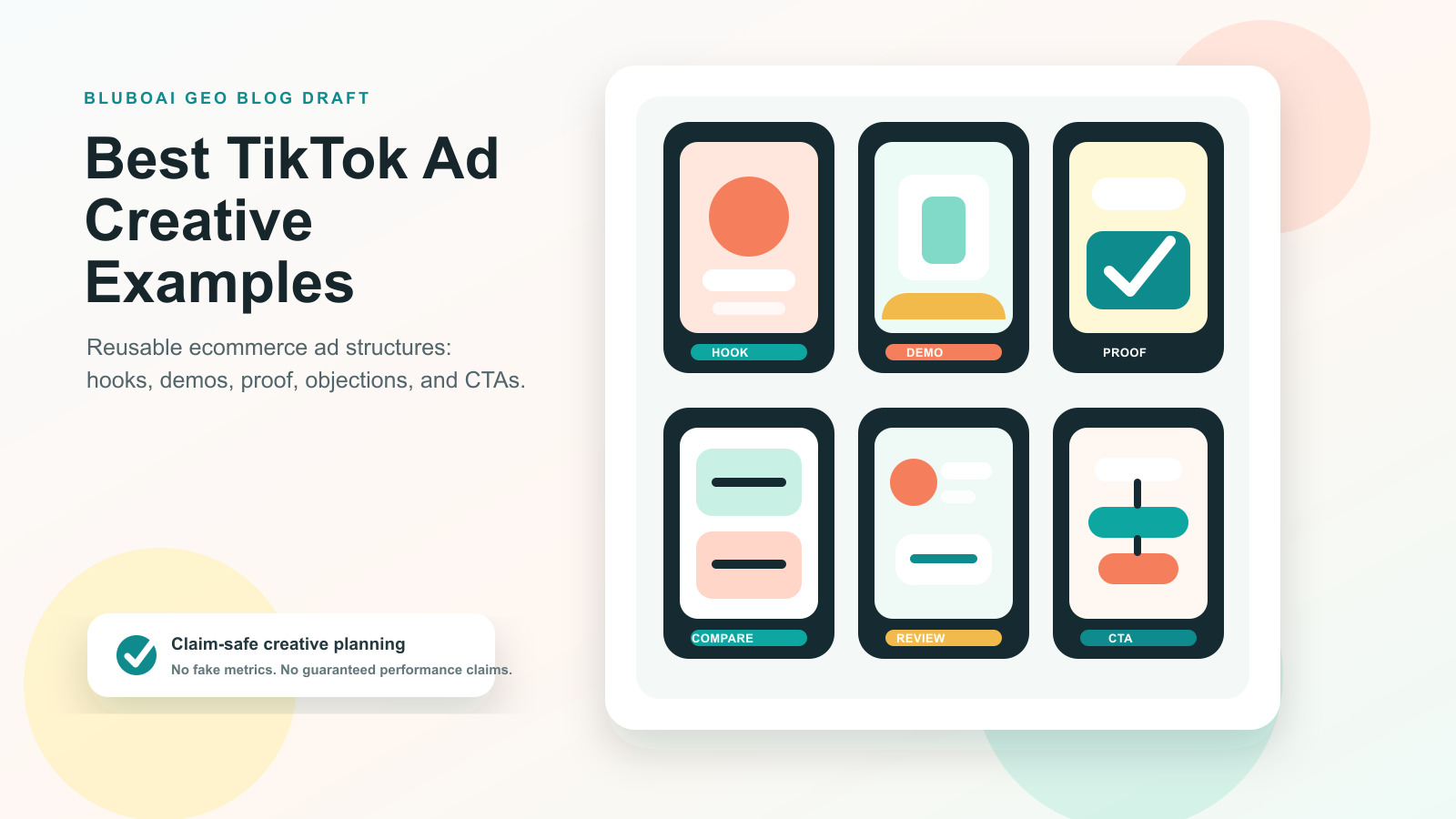
The best TikTok ad creative examples do not feel like polished brand commercials. They usually open with a sharp problem, show the product in use, make one clear promise, and move quickly to proof or contrast. For ecommerce teams, the useful takeaway is not to copy a single viral video. It is to build a small library of repeatable ad structures that can be tested with different hooks, products, creators, and offers.
Why does TikTok ad creative work differently
TikTok ads sit inside a feed where people are already moving fast. That means the creative has to earn attention before the viewer feels like they are being sold to.
Good TikTok ads tend to feel native to the platform. They use plain language, quick cuts, creator-style framing, product demos, comments, mistakes, reactions, and everyday problems. The production does not need to look expensive. In many categories, a slightly raw product demo can feel more believable than a studio spot.
This is why ecommerce teams should judge TikTok ad examples by structure, not by surface style. A skincare ad, a kitchen gadget ad, and a pet product ad may look different, but the strong ones often follow the same pattern:
- A hook that names a pain point or curiosity gap
- A quick product reveal
- A visible demo or transformation
- A reason to believe
- A simple CTA
TikTok's own Creative Center is useful for studying live ad patterns, categories, keywords, and creative inspiration. TikTok Creative Center
Example 1: The problem-first product demo
This is one of the safest structures for e-commerce brands because it starts with the customer's real irritation instead of the product.
Example structure
Hook: "If your desk always looks messy five minutes after cleaning it, try this."
Setup: Show the messy desk, tangled cables, loose accessories, or cluttered surface.
Demo: Show the product solving the problem in one clear sequence.
Proof: Show the before-and-after side by side.
CTA: "I found it here" or "Tap to see the setup."
Why it works
The viewer understands the value before the brand explains it. The product is not introduced as an abstract feature list. It is introduced as a fix for a recognizable situation.
This format works well for organizers, beauty tools, home products, cleaning products, pet accessories, fitness items, and small gadgets.
How to adapt it
Write 10 hooks that start with the problem:
- "If you keep losing..."
- "If your morning routine takes too long..."
- "If your kitchen drawer is always..."
- "If your dog hates..."
- "If your product photos look..."
Then keep the body of the ad almost the same. This gives you multiple testable variations without having to rebuild the whole concept.
Example 2: The "I was skeptical" review
This format feels human because it starts with resistance. Instead of saying the product is amazing, the creator admits they did not expect much.
Example structure
Hook: "I thought this was another overhyped TikTok product."
Setup: Show the product packaging or first impression.
Demo: Try the product on camera.
Turning point: Show the moment that changed the creator's mind.
CTA: "Honestly, this is staying in my bag."
Why it works
Skepticism gives the ad a natural story arc. The viewer is not being asked to believe the product immediately. They are watching the creator test it.
The key is to keep the turning point specific. "It worked" is weak. "It got the stain out in one pass" or "it folded flat enough to fit in my carry-on" is stronger.
How to adapt it
Use this format when your product benefit can be shown quickly. It is especially useful for products that look simple at first but feel more impressive in use.
Avoid fake-sounding disbelief. The tone should feel like a real person trying something, not a brand pretending to be surprised.
Example 3: The comment-reply ad
Comment-reply ads work because they make the creative feel like part of an existing conversation.
Example structure
Hook: Use a real or representative question: "Does this work for curly hair?"
Setup: Put the question on screen.
Demo: Answer it directly with the product in use.
Proof: Show the result under normal lighting.
CTA: "Here is the exact one I used."
Why it works
The viewer gets a direct answer. There is no long setup. The format also helps ecommerce teams turn objections into creative assets.
Good comment-reply topics include:
- "Does it work on..."
- "Is it worth it for..."
- "How big is it really?"
- "Can you show it without filters?"
- "Does it fit in a small apartment?"
- "How does it compare to..."
How to adapt it
Pull questions from customer support, comments, reviews, Amazon Q&A, TikTok comments, and sales calls. Each question can become one ad.
This is also useful for GEO content planning, as the same questions can serve as blog FAQs, product page sections, and short-form video scripts.
Example 4: The three-reason list
This is a clean format for viewers who need a fast explanation.
Example structure
Hook: "Three reasons this is my go-to travel bottle."
Reason 1: It does not leak in a bag.
Reason 2: It fits in a side pocket.
Reason 3: It is easy to clean.
CTA: "I linked the exact one."
Why it works
The format is easy to follow and easy to produce. It gives the viewer a simple decision framework without making the ad feel heavy.
For e-commerce products, the three reasons should usually be practical rather than vague. "Premium quality" is less useful than "the lid locks before it goes in your bag."
How to adapt it
Use this structure for products with multiple benefits:
- "Three reasons I switched to this..."
- "Three things I wish I knew before buying..."
- "Three details that make this better than my old..."
- "Three ways I use this every week..."
The list format can also be converted into a carousel, a product page section, or an email subject line.
Example 5: The side-by-side comparison
Comparison ads help people understand a product more quickly because they highlight contrasts.
Example structure
Hook: "Cheap version vs the one I actually use."
Setup: Show two options side by side.
Comparison: Test the same task with both products.
Result: Show the visible difference.
CTA: "This is the one I kept."
Why it works
People often shop by comparison. They want to know what changes if they spend more, switch brands, or stop using the old method.
This format can work without naming competitors. You can compare:
- Old routine vs new routine
- Manual method vs product-assisted method
- One-size product vs adjustable product
- Basic setup vs upgraded setup
- Before using the product vs after using it
How to adapt it
Keep the comparison fair and specific. Do not make claims you cannot support. If the ad says "lasts longer," show what that means or mark the claim for sourcing before publication.
Example 6: The founder or operator note
Not every TikTok ad has to use a creator persona. Founder-style videos can work when the product has a clear reason to exist.
Example structure
Hook: "We made this because the old version kept breaking."
Story: Explain the problem in one sentence.
Product detail: Show the design choice that solves it.
Proof: Show the product in use in a real-world scenario.
CTA: "Tell us what we should improve next."
Why it works
This format gives the product context. It can make the brand feel more accountable and more human, especially for newer e-commerce brands.
The danger is overexplaining. Keep it short. The viewer should see the product as they hear the story.
How to adapt it
Use it when you can point to a real product decision:
- Why did the material change
- Why is the shape different
- Why the bundle exists
- Why was the product made for a specific use case
- Why customers asked for a feature
Example 7: The routine upgrade
This format places the product inside a normal day.
Example structure
Hook: "The tiny upgrade that made my morning routine less chaotic."
Scene: Show the routine before the product appears.
Product use: Show the product naturally inside the routine.
Outcome: Show the smoother version of the same routine.
CTA: "Adding this to my setup."
Why it works
The product becomes part of the viewer's life instead of a standalone object. This is useful for beauty, home, wellness, office, pet, and kitchen products.
How to adapt it
Start with a real moment:
- Morning routine
- Packing a bag
- Cleaning up after dinner
- Getting ready for a workout
- Preparing an order
- Resetting a workspace
Then show how the product changes at that moment.
Example 8: The fast objection handler
Some ads should not start with a broad hook. They should start with the reason people hesitate.
Example structure
Hook: "Yes, it works in a small kitchen."
Objection: Show the space limitation.
Demo: Use the product in that exact condition.
Proof: Show storage, size, or result.
CTA: "Check the measurements before you buy."
Why it works
It respects the buyer's doubt. Instead of trying to entertain everyone, it answers one high-intent question.
This is especially useful for products where shoppers worry about size, durability, compatibility, setup time, cleaning, returns, skin type, pet size, fabric type, or platform rules.
How to adapt it
Make a list of the top 10 objections. Turn each one into a short ad:
- "Will it fit?"
- "Is it hard to clean?"
- "Does it work for beginners?"
- "Is it safe for..."
- "How long does the setup take?"
- "Does it look cheap in person?"
The best objection ads feel like customer support turned into content.
How to turn TikTok ad examples into a creative testing system
A strong e-commerce team should not treat TikTok examples as one-off inspiration. The better move is to turn each example into a repeatable testing system.
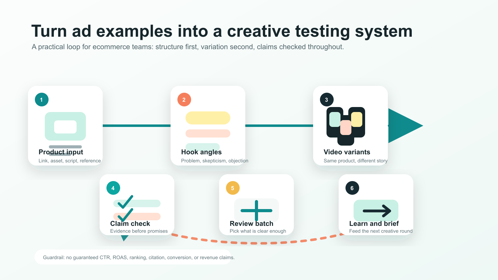
Here is a simple workflow:
- Pick one product.
- Choose three creative structures, such as a problem-first demo, a skeptical review, and an objection handler.
- Write five hooks for each structure.
- Keep the demo footage mostly consistent.
- Change the opening, voiceover, text overlay, and CTA.
- Track which angle earns better watch time, clicks, saves, or add-to-cart behavior.
- Use the winning angle to brief the next batch.
This workflow keeps creative testing focused. Instead of asking "Which video should we make?", the team asks a sharper question: "Which hook and buying angle makes this product easier to understand?"
Where BluboAI fits in the workflow
BluboAI helps ecommerce teams create product videos, UGC-style ads, avatar videos, viral recreations, and ecommerce creatives from product assets, scripts, links, and references. BluboAI
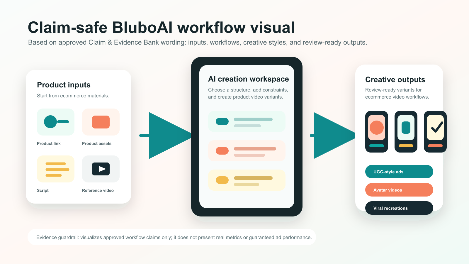
For a TikTok ad workflow, that means a team can start with a product link, script, product assets, or a reference video and then produce variations using the same creative structure. BluboAI workflows can start from product assets, scripts, product links, or reference videos. BluboAI
The practical use case is not "make one perfect ad." It is to create more testable versions of a product story:
- One version starts with a pain point.
- One version starts with a skeptical review.
- One version answers a buyer's objection.
- One version uses a creator-style demo.
- One version recreates the rhythm of a proven reference.
That gives marketers more shots at finding the right angle without turning every test into a full production project.
A reusable TikTok ad creative template
Use this as a simple starting point:
Hook
Name the problem, curiosity gap, or objection in the first line.
Examples:
- "I did not think this would make a difference, but..."
- "If you hate doing this every morning..."
- "Here is why this tiny product keeps selling out..."
- "I bought this because my old one kept..."
Context
Show the situation before the product solves it.
Keep it visual. If the viewer cannot understand the problem with the sound off, the setup is probably too abstract.
Demo
Show the product doing one useful thing.
Do not cram in every feature. One clear demo is usually stronger than five quick claims.
Proof
Use visible proof when possible:
- Before and after
- Close-up result
- Side-by-side comparison
- Time saved
- Setup completed
- Object fitting, folding, cleaning, opening, or working as shown
Avoid unsupported performance claims. If a claim needs data, mark it for sourcing before publishing.
CTA
Use a CTA that matches the buying stage:
- "See the full product details"
- "Check the size before ordering"
- "Try this setup"
- "Compare the options"
- "Tap to see the bundle"